Gallery
A tour of what Bio-ORACLE data looks like once it lands in Python. Every figure
below is built straight from load_layer using the
xarray and pandas plotting APIs, with cmocean
colormaps and cartopy projections.
Reproducible
Install the plotting extra and every figure here can be regenerated:
pip install "pyo-oracle[viz]"
The exact code that produced these images lives in
docs/gallery/generate_images.py.
-
Global maps & projections
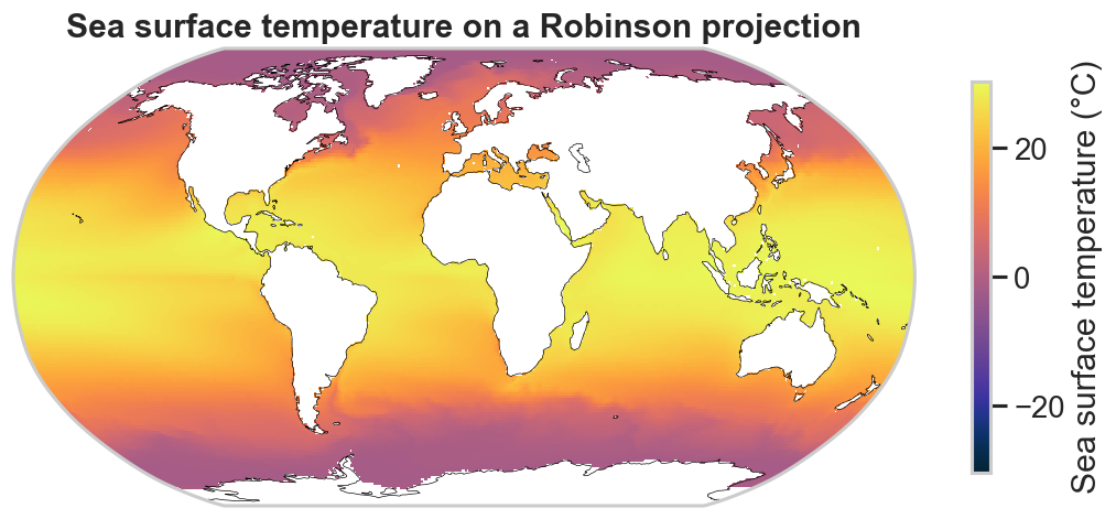
World temperature maps with oceanographic colormaps, a Robinson projection and coastlines, and a regional zoom.
-
Climate change
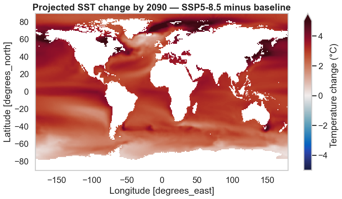
Warming maps, faceted SSP scenarios, and 2020–2090 projection trends.
-
Distributions & gradients
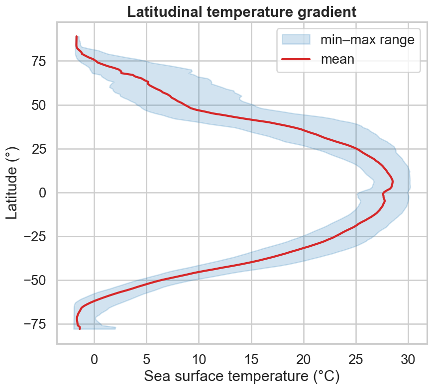
Latitudinal temperature gradients, distributions, and a depth-layer comparison with the pandas plotting API.
-
Multi-variable relationships
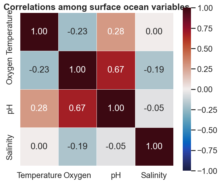
Join temperature, oxygen, pH and salinity into one frame and explore how they covary.